C L A S S I C , V I N T A G E G R A P H I C T E E S
PETER M., ENGLAND, U.K.
FIRSTLY, THIS POST is made from 100% cotton there isn't a fibre of polyester in sight! Right, you know where I sit on the cotton / polyester debate, so let me take you through my graphic tees from 2003-2010. Why only up to 2010, I hear you ask? Well this is when I consider the classic Casual Luxury period of A&F when a graphic tee really was a graphic tee - with design and quality really oozing style - while from 2010 the quality began to wane, in my opinion. I consider the tees in this piece to be retro classics from an era of A&F (one although too arrogant for its own good) of when were backed up by quality to such a level that just wearing them made you feel like you were a member of an exclusive club. So let's get into our Delorean and go back to where it all began.
I have a confession: my first visit to an A&F wasn't of my choosing. As I write this post coming up to 12 years since my first fierce encounter with the A&F brand, I couldn't of given two hoots about it until I walked into that first store in Florida; if only I had known now what I was walking into back then! So where better to start than right back at the beginning, so the following three photos are taken from the winter 2003 collection of graphic tees.
The first is so simple, it's a plain graphic tee with red trim around the neck and sleeves with a classic screenprint "Abercrombie & Fitch" on the interior back just below the neck line. Timeless and classic.

The second is a classic A&F white graphic tee with a heavy Abercrombie appliqué across the chest, this is then set against a classic A&F leather jacket. Simple but makes a great Abercrombie statement!

My first full Abercrombie & Fitch appliqué tee, navy blue with bright golden yellow appliqué, and, well, if you're going to set this classic off against a garment it might as well be nothing finer than an Ezra Fitch jacket! Don't mind if I do sir!!

Now it's time to move on a couple of years to 2005: the first tee is from a collection that A&F ran around sports, colleges and universities with graphic logoing on the front and on the left sleeve - the hidden secret is the felt A&F logo on the inside of the tee!

And now let's have a look at the inside detail.

This next "Abercrombie NY" tee throws up an interesting debate you can have among yourselves: I purchased this tee in 2005, and 10 years later with the raft of Abercrombie NY tees on the website, my question to you is, which do you prefer? I know where I sit on that argument, and, yes, this tee is 100% cotton! I've also set this tee off against a background of classic A&F store bags from down the years - didn't think I would say it but even these classic bags say more about how classically cool A&F used to be.

While white tees were my favourite colour for '05, my picks for '06 take on many different colours and designs - starting off with this fierce brown tee with nicking to the sleeves and neckline, and the destressed screen print is offset with subtle stitching within the print itself. This tee is also set against some classic A&F bags of the time.

Next from 06 is a heavily faded Abercrombie American football inspired screenprint tee - the faded red "65" set on a dark grey tee works perfectly and also looks good accompanied with an A&F leather jacket. This tee and I have certainly done some travelling together since 06!

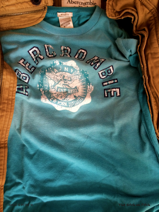
My next tee from '06 is in a classically cool faded two-tone turquoise print graphic tee - the A&F badge in the centre almost resembles a police badge with references to the good old Adirondack with the tee nestled in a A&F Adirondack jacket!
Continuing in '06, the next two tees complete a stunning set of Abercrombie NFL inspired tees. The first of the two is very similar to the previous year's Abercrombie "65" tee, but this one has added paint splattered across it and a lived-in worn, faded look set against another stunning background of classic A&F store bags.

Keeping a very similar theme, but from the A&F ATH. DEPT, this tee has fierce multi-coloured paint splatter effect with a true classic "33" print and the store bags well the perfect pair.

My final tee from '06 (a very good graphic tee year!) is a heavy appliqué laden, dark blue tee with faded patches around the neckline. This tee always works well with an A&F weather warrior jacket.

2007 was a vintage year for A&F graphic tees where the level of detail really kicked it up a notch, none more so than this faded sky blue tee with classic "A. Fitch" front logo and "7" appliqué. But there's more to this tee...

Apart from the heavy level of nicking around the neck and the sleeves, there is an even larger appliqué "7" on the back of the tee.

Sticking with the same colour theme, my next tee is a heavy logo laden panther printed tee with heavy nicking detail around the neck and sleeves; the contrast between the white printed logo and the black (black back in 2007?!) Fitch logo sets this apart from many different A&F tees.

The added bonus with this tee is the additional printed "34" on the back, simple but oh so effective.

Next up, we are going to take it down a notch. This is a far simpler tee; no appliqué in sight on this oatmeal number. What I like about this the most is that the main print is on the inside of the tee with the classic Indian warrior head and a simple Abercrombie & Fitch vertical logo on the outside right of the tee, with a few more classic store bags for show.

Everybody needs a moose print in their A&F lives, and this is one of my preferred moose numbers with a nice appliqué A&F logo on the upper left chest. This also has an interesting A&F label on the bottom of the tee to add something a bit different. You may have noticed the top-left store bag is the current plain store bag being used at the moment at A&F. Think I know which bags I prefer.

Keeping the moose theme going, my next tee is another moose print classic and one of the largest prints on any of my A&F tees! In addition some lovely burgundy appliqué "Fitch NY" logoing and references to ADK. MTNS regions, this is a classic white tee from a classic era.

My final moose tee in my moose tee trilogy is a dark grey tee that actually has it all: you have the nice moose print based on the Adirondack region, with a subtle "AF" appliqué and nicely stitched number 3 - to finish off this series of 2007 tees just nicely.

Moving onto 2008, I have selected two tees. I found my love for A&F tees beginning to wane, but these in particular are cracking tees full of Fitch history. The first is a plain grey tee with nice bright orange "Abercrombie & Fitch" appliqué and printed "19" and "NY". To finish it off, it is nestling in an A&F sentinel jacket.

My final tee of 2008, I love the colour contrast from the royal blue tee to the beautiful yellow appliqué of the "A.Fitch" with a "58" print, pair of jeans and some flip-flops perfect!

My final, final tee, taken from 2010, and as I remember, it cost US$40 at the time! God, I would pay 40 bucks if A&F still made tees like this one! A contrasting grey tee - like a lot of grey, don't I! - while the appliqué used is actual denim. Tee sitting in a red A&F weather warrior.

So after such a glut of A&F tees in 2003-2007, why were there so few to 2010, and why have I not selected any to this date. There are a number of reasons for this. Firstly, RUEHL. I first visited RUEHL in 2007 and basically from 2007-2010, almost all of my tees came from RUEHL. There was something about the exclusivity of wearing a RUEHL tee compared to an A&F tee which is even more pertinent to this day. Also, I started buying A&F classic shirts in ever increasing numbers from 2006 onwards which now make up a large percentage of my current wardrobe.
If I'm being truthful, as A&F became more common place in the UK and lost that air of exclusivity, I found myself not wanting to wear A&F graphic tees as much as I did before: I wanted to tone down the "in your face" logo tees, so I moved into A&F striped crew tees which I still buy to this day. However, I'm very proud of the tees here that I have shared with you, the reader of The Stitch on Fitch. I consider this the classic period of A&F tees: whether you agree with me or not, that is your opinion. But after you've looked over these photos, head over to the A&F website and look at the men's tees and judge for yourself. Personally, I'm hoping for a triumphant return to form with some classic A&F Ezra Fitch graphic tees in the Fall / Winter season 2015. If that's not the case, it will look like I'll be wearing these classics for a while longer!
Peter